Event Landing Page: Structure, Mistakes and How to Build One
Last updated 29 July 2026
An event landing page answers four questions before it asks for anything: what it is, when it happens, where, and why it is worth the time. Registration pages lose people by burying the date, hiding the time zone, or asking for six fields to attend something free.
This is not your website. Your website is the permanent home with navigation, an about page and a blog. This is a single campaign page with one action, and it usually points traffic back to your main site. Most people run both.
When to use one
- You are running a workshop, meetup, conference or launch event with a fixed date.
- You need one page to put in invitations, ads and social posts.
- The event page on the ticketing platform cannot be edited or branded.
- You are running several sessions and want to see which one people pick.
What goes on the page
- The name, the date and the format above everything else — those are the qualifying facts.
- The time zone, spelled out. A registrant in the wrong one is a no-show.
- Who is speaking or hosting, and why they are worth an hour.
- What attendees leave with, stated concretely.
- Agenda or running order, if the event is long enough for that to matter.
- One registration form, with the fewest fields the event actually requires.
What kills it
- Date and time below the fold, so the first question a reader has goes unanswered longest.
- No time zone, which quietly converts registrations into no-shows.
- Six fields for a free webinar. Ask for what you will use, not what you might.
- No mention of a recording, when “can I watch it later” is the most common objection.
- Leaving the page up unchanged after the event, so it collects traffic and converts none of it.
What we measured across 675 live pages
An event page competes with a calendar, so it has to deliver its qualifying facts fast and ask once. These two measurements from our crawl describe how much reading a typical B2B page expects before it makes its ask.
34 words
was the median amount of body copy before the first in-body call to action, with the upper quartile at 101 words. This is document-order position, not a claim about the fold. (n = 464)
40.7%
of 675 pages asked for exactly one thing. The rest split the visitor's attention across two or more competing primary actions.
Source: The State of SaaS Landing Pages — our own crawl of 800 sites sampled from Y Combinator's public company directory — active companies classified B2B/SaaS, of which 675 returned a scoreable page. Collected 25 July 2026, seed 20260725; the full dataset and method are published so the sample can be reproduced.
Building one with LeadzLander
Describe the page in plain English
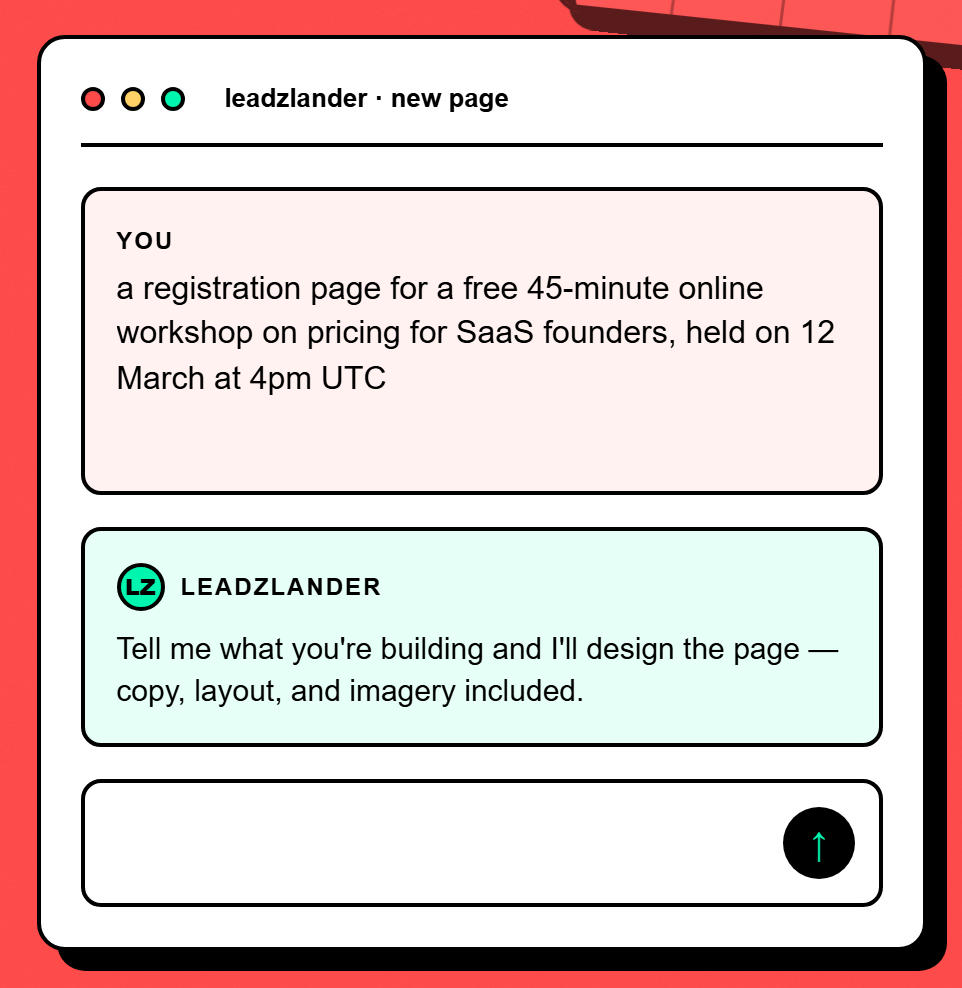
Type what the page is for, who it is aimed at and what you want the visitor to do. For this use case that looks like: “a registration page for a free 45-minute online workshop on pricing for SaaS founders, held on 12 March at 4pm UTC” — no formatting, no prompt engineering.
Answer a few clarifying questions
LeadzLander asks a short set of questions about your audience, tone and goal, generated from your brief rather than a fixed form. Skip any you do not have an answer to — it fills the gaps itself.
Watch it build the page
It researches the audience, writes the copy, picks a layout and assembles the page. You see the sections appear as they are composed rather than staring at a spinner.
Refine by chatting, not dragging
Chat on the left, live preview on the right. Ask for a shorter headline, a different tone or a new hero image and the preview updates. After each edit, badges mark exactly which sections changed.
Publish, then watch what converts
One click puts it on a live URL we host. The form captures leads you can export as CSV, and the insights panel shows views, visitors, traffic sources and the leads themselves.
Questions
What should an event landing page include?
The name, date, time with time zone, and format come first — those are the facts that decide whether someone can attend at all. Then who is hosting, what attendees leave with, and an agenda if the event is long enough to need one. Finish with a single registration form asking only for what you will actually use.
How many form fields should an event registration have?
As few as the event genuinely requires. A free webinar needs an email and possibly a first name. A paid, in-person event with catering reasonably needs more. The test is whether you will use the field: asking for company size on a free session costs you registrations and gives you data nobody reads.
What should I do with the page after the event?
Do not leave it stale. Replace the registration form with the recording, the slides or a link to the next session — the page keeps attracting traffic from links and search after the date passes, and an unchanged page converts none of it. Keeping the URL and swapping the content also preserves whatever ranking it earned.
Other things people build
- Waitlist page — Prove demand before you build, and leave with a list of people to tell when you ship.
- Newsletter signup page — Turn a reader who liked one thing you wrote into someone who hears from you every week.
Build one free — no card
Describe the page in a sentence and see what comes out. Hosting and lead capture are included on the free plan.
Start free