Newsletter Landing Page: What Converts and How to Build One
Last updated 29 July 2026
A newsletter landing page sells a subscription paid in attention. It works when it names who the newsletter is for, what arrives, and how often — then asks for one email. Vague promises like “insights and updates” are why most signup pages underperform their traffic.
This is not your website. Your website is the permanent home with navigation, an about page and a blog. This is a single campaign page with one action, and it usually points traffic back to your main site. Most people run both.
When to use one
- You are sending traffic from social posts to something better than a profile link.
- Your newsletter lives on a platform whose default signup page you cannot change.
- You are running ads for subscribers and need a page that matches the ad.
- You want a permanent link to put in a bio, a talk, or a podcast description.
What goes on the page
- Who it is for, stated plainly enough that the wrong reader self-selects out.
- What actually arrives — the format, not the aspiration.
- The cadence. “Weekly, on Tuesdays” converts better than “regularly”.
- One representative issue, linked or excerpted, so the promise is checkable.
- Subscriber count or a named reader, if the number is real and worth stating.
- One email field, and a note that unsubscribing is one click.
What kills it
- “Insights, tips and updates” — a description that would fit any newsletter ever written.
- Hiding the cadence, which is the single thing a hesitant reader most wants to know.
- No sample issue, asking for a subscription sight unseen.
- Competing calls to action — subscribe, follow, book a call — on a page with one job.
- A subscriber count invented to look established. It is checkable, and being caught is fatal.
What we measured across 675 live pages
A newsletter page asks for a small commitment, so it lives or dies on whether the promise is specific and whether the ask is singular. Two figures from our crawl of live B2B pages set the bar you are clearing.
40.7%
of 675 pages asked for exactly one thing. The rest split the visitor's attention across two or more competing primary actions.
42.2%
of 675 pages showed any social proof at all — a logo wall, a testimonial, a customer count or a review score.
Source: The State of SaaS Landing Pages — our own crawl of 800 sites sampled from Y Combinator's public company directory — active companies classified B2B/SaaS, of which 675 returned a scoreable page. Collected 25 July 2026, seed 20260725; the full dataset and method are published so the sample can be reproduced.
Building one with LeadzLander
Describe the page in plain English
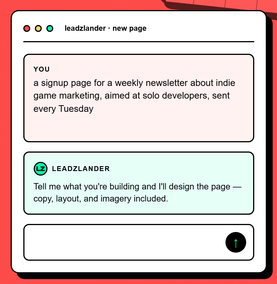
Type what the page is for, who it is aimed at and what you want the visitor to do. For this use case that looks like: “a signup page for a weekly newsletter about indie game marketing, aimed at solo developers, sent every Tuesday” — no formatting, no prompt engineering.
Answer a few clarifying questions
LeadzLander asks a short set of questions about your audience, tone and goal, generated from your brief rather than a fixed form. Skip any you do not have an answer to — it fills the gaps itself.
Watch it build the page
It researches the audience, writes the copy, picks a layout and assembles the page. You see the sections appear as they are composed rather than staring at a spinner.
Refine by chatting, not dragging
Chat on the left, live preview on the right. Ask for a shorter headline, a different tone or a new hero image and the preview updates. After each edit, badges mark exactly which sections changed.
Publish, then watch what converts
One click puts it on a live URL we host. The form captures leads you can export as CSV, and the insights panel shows views, visitors, traffic sources and the leads themselves.
Questions
What makes a newsletter landing page convert?
Specificity about three things: who it is for, what arrives, and how often. Most signup pages fail on all three at once — “insights and updates” describes every newsletter ever written, so it gives a reader no reason to choose yours. Linking one real issue does more than any amount of persuasive copy, because it turns a promise into something checkable.
Should I use my email platform's built-in signup page instead?
It depends on whether you are sending campaign traffic to it. Built-in pages are fine as a default destination, but they are usually template-locked, hard to match to an ad, and give you no view of where signups came from. If you are running ads or posting a link repeatedly, a page you control — with its own analytics and source breakdown — pays for itself quickly.
How many subscribers should I show before displaying a count?
Show it when it is genuinely persuasive, and never invent it. A small number stated confidently alongside a named reader or a quote often does more than a big vague one. If the count is not doing work for you yet, leave it off and let one real issue carry the page instead.
Other things people build
- Waitlist page — Prove demand before you build, and leave with a list of people to tell when you ship.
- Event registration page — Convert someone who just heard the event exists into someone who has registered for it.
Build one free — no card
Describe the page in a sentence and see what comes out. Hosting and lead capture are included on the free plan.
Start free